Visualization of Spatial Data
Outline
plot sf objects
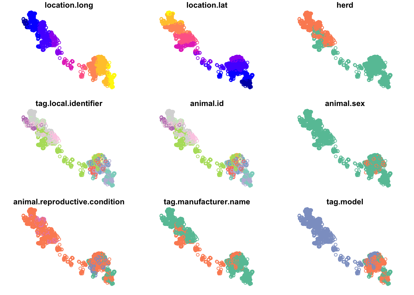
Previously we used plot() to view our sf objects - this is a nice quick way to visualize our data for verification or glance at the different variables.
First, read in the caribou data:
You can see that by default, this plots all of the attributes (up to 9). But we can plot just the points by extracting just the geometry with st_geometry():
st_geometry(caribou) |>
  plot()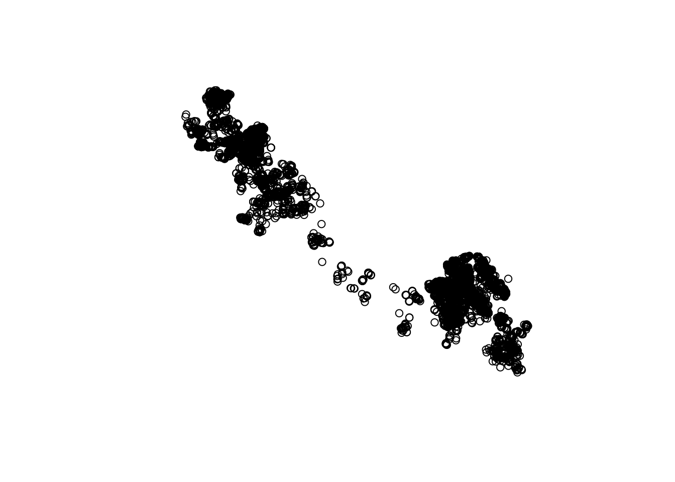
Or, plot just one or a few variables of interest:
caribou |>
  select(herd, animal.sex) |> # select just the herd and sex columns
  plot(key.pos = 1) # put the legend at the bottom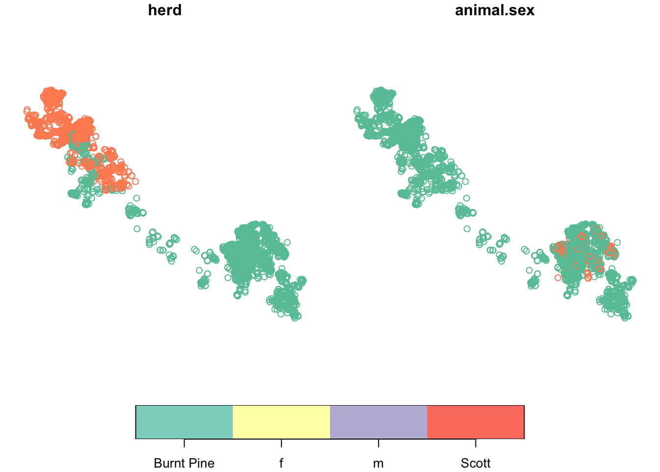
We can also add a base map for context. Let’s use the bcmaps package to get a base map. bcmaps has a large collection of useful maps of B.C.:
# A tibble: 37 × 6
   layer_name                title         record resource using_shortcuts local
 * <chr>                     <chr>         <chr>  <chr>    <lgl>           <lgl>
 1 airzones                  British Colu… e8eee… c495d08… TRUE            FALSE
 2 bc_bound                  BC Boundary   b9bd9… f591698… FALSE           FALSE
 3 bc_bound_hres             High Resolut… 30aeb… 3d72cf3… FALSE           FALSE
 4 bc_cities                 BC Major Cit… b678c… 443dd85… TRUE            FALSE
 5 bc_neighbours             Boundary of … b9bd9… f591698… FALSE           FALSE
 6 bec                       British Colu… f358a… 3ec24cb… TRUE            FALSE
 7 cded_raster               Get Canadian… <NA>   <NA>     FALSE           FALSE
 8 cded_stars                Get Canadian… <NA>   <NA>     FALSE           FALSE
 9 census_dissemination_area Current Cens… a091f… a7fa66d… TRUE            FALSE
10 census_division           Current Cens… ef179… 36b530c… TRUE            FALSE
# ℹ 27 more rows

------------------------
All layers are downloaded from the internet and cached
on your hard drive at /Users/andy/Library/Caches/org.R-project.R/R/bcmaps.
Let’s get the B.C. Natural resource boundaries:
nr <- nr_districts()nr_districts was updated on 2023-11-03st_geometry(nr) |>
plot()
caribou |>
st_transform(st_crs(nr)) |> # transform so in the same crs as nr
select(herd) |> # select just the herd column (called herd)
plot(add = TRUE)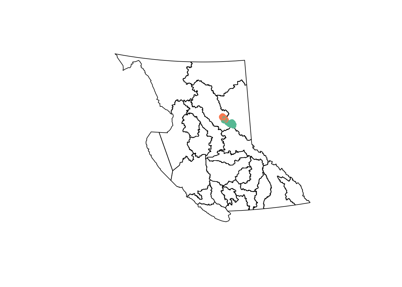
But we can quickly get past the point where basic plotting lets us do what we want to do…
ggplot2
ggplot2 is a plotting package built on the theory of the “Grammar of Graphics”, where a plot is built up in layers:
- We start with the data, then
- add the graphical marks (points, lines, bars, etc. called “geom”s) we want to use to represent the data, and
- specify “aesthetics” for how to map variables in our data to visual representations on the plot.
Let’s start with a simple histogram of fixes over time:
library(ggplot2)

ggplot(data = caribou) + # start with data
  geom_histogram( # specify the geom
    aes( # specify aesthetics - how to map variables to visual representations
      x = date_time
    ),
    position = "dodge" # make the bars side by side instead of stacked
  )
`stat_bin()` using `bins = 30`. Pick better value with `binwidth`.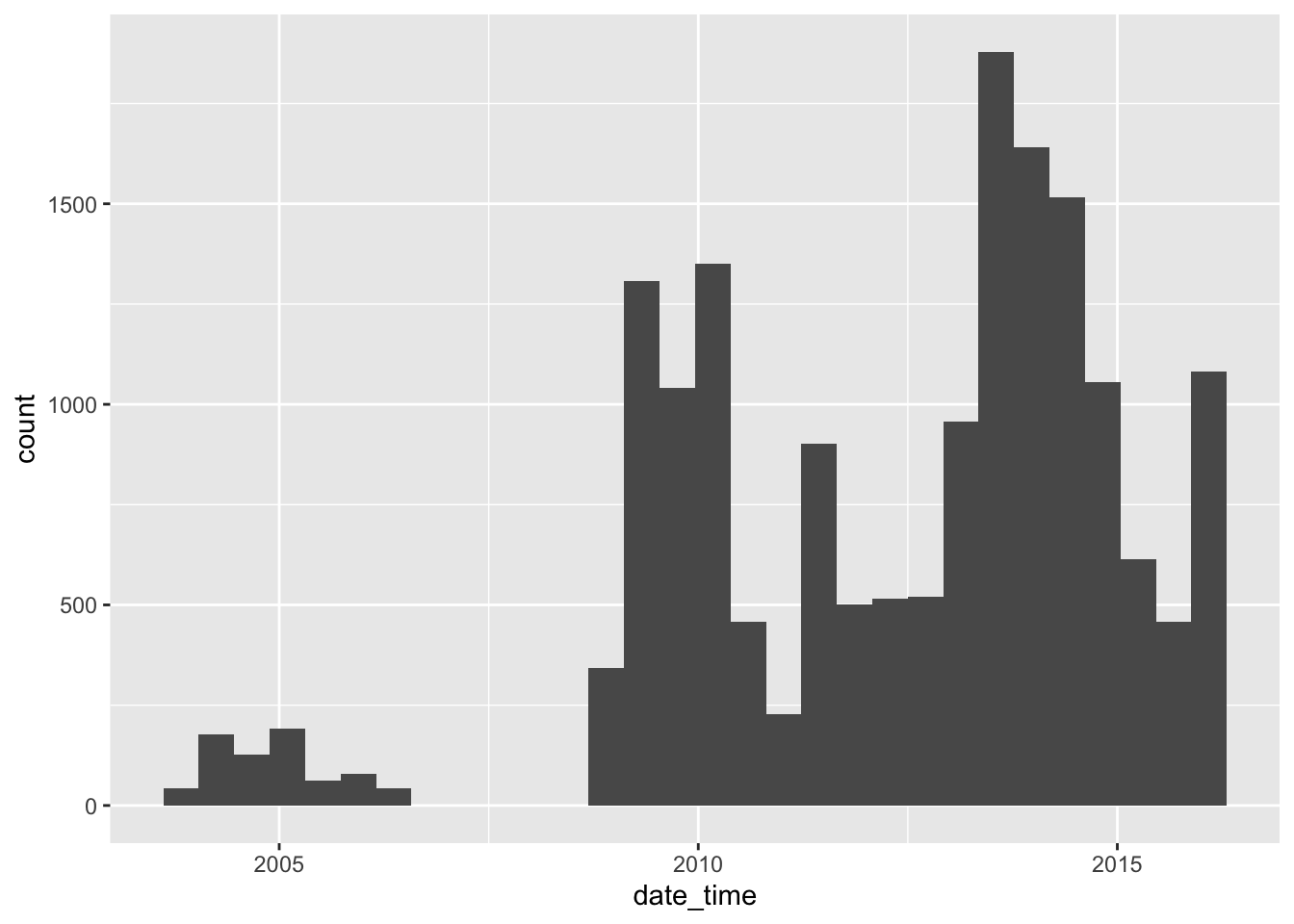
We can add a “fill” aesthetic to differentiate herds, i.e., group the bars by herd, and use a different fill colour for each herd:
caribou <- transform_bc_albers(caribou)

ggplot(data = caribou) + # start with data
  geom_histogram( # specify the geom
    aes( # specify aesthetics - how to map variables to visual representations
      x = date_time,
      fill = herd
    ),
    position = "dodge" # make the bars side by side instead of stacked
  )
`stat_bin()` using `bins = 30`. Pick better value with `binwidth`.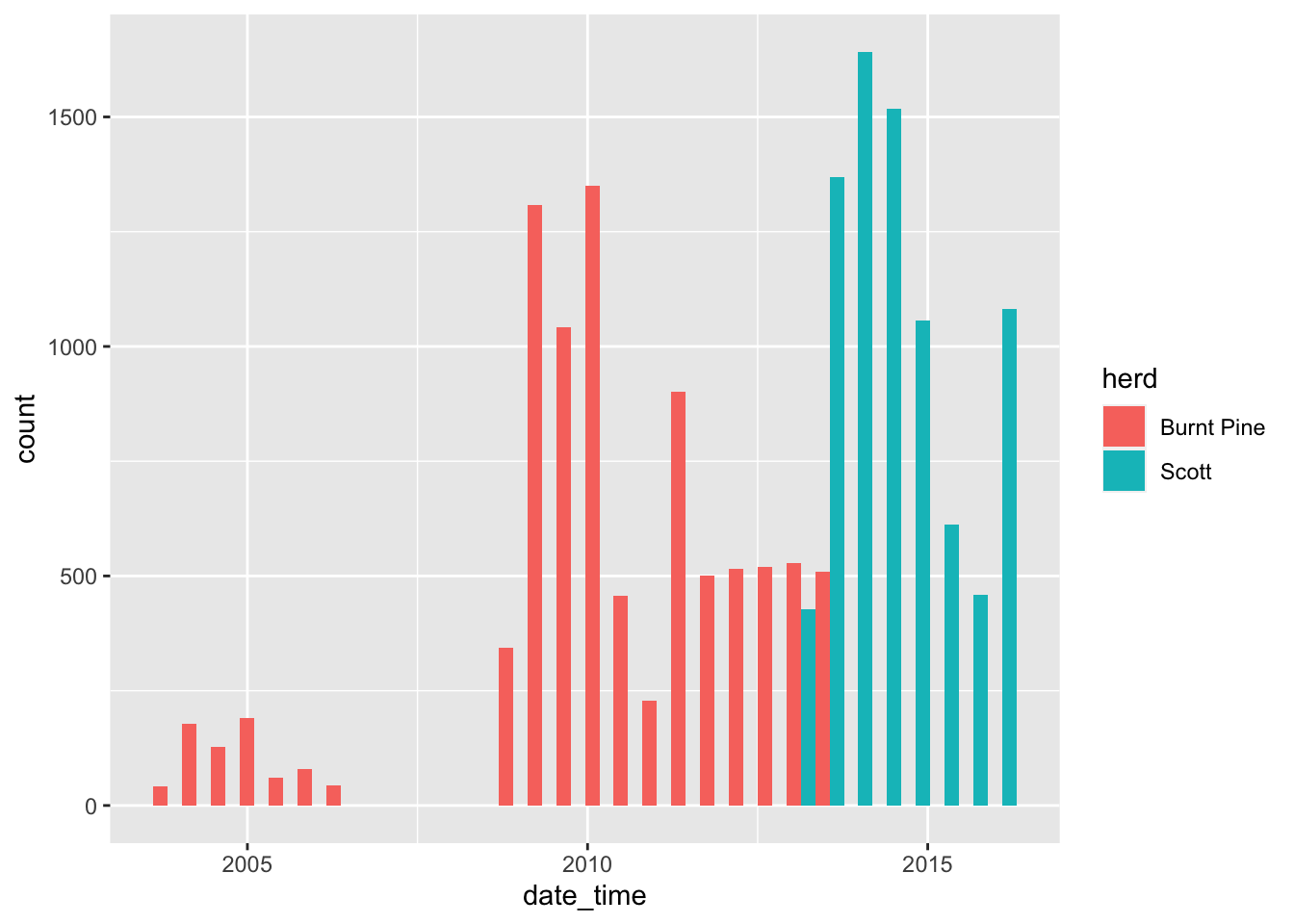
We can use the same pattern to make a map:
ggplot(data = caribou) +
  geom_sf() # x and y are inferred from the geometry column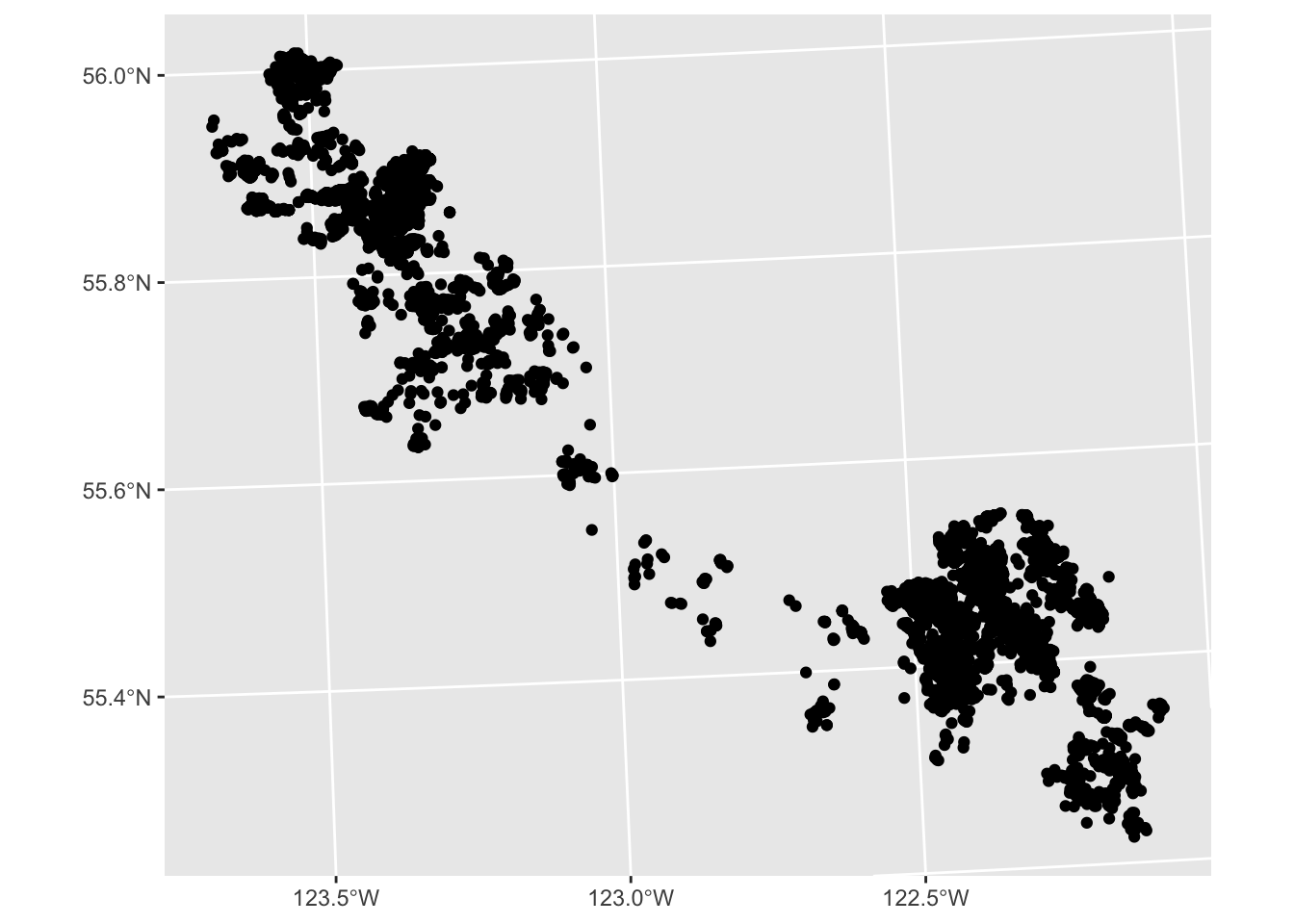
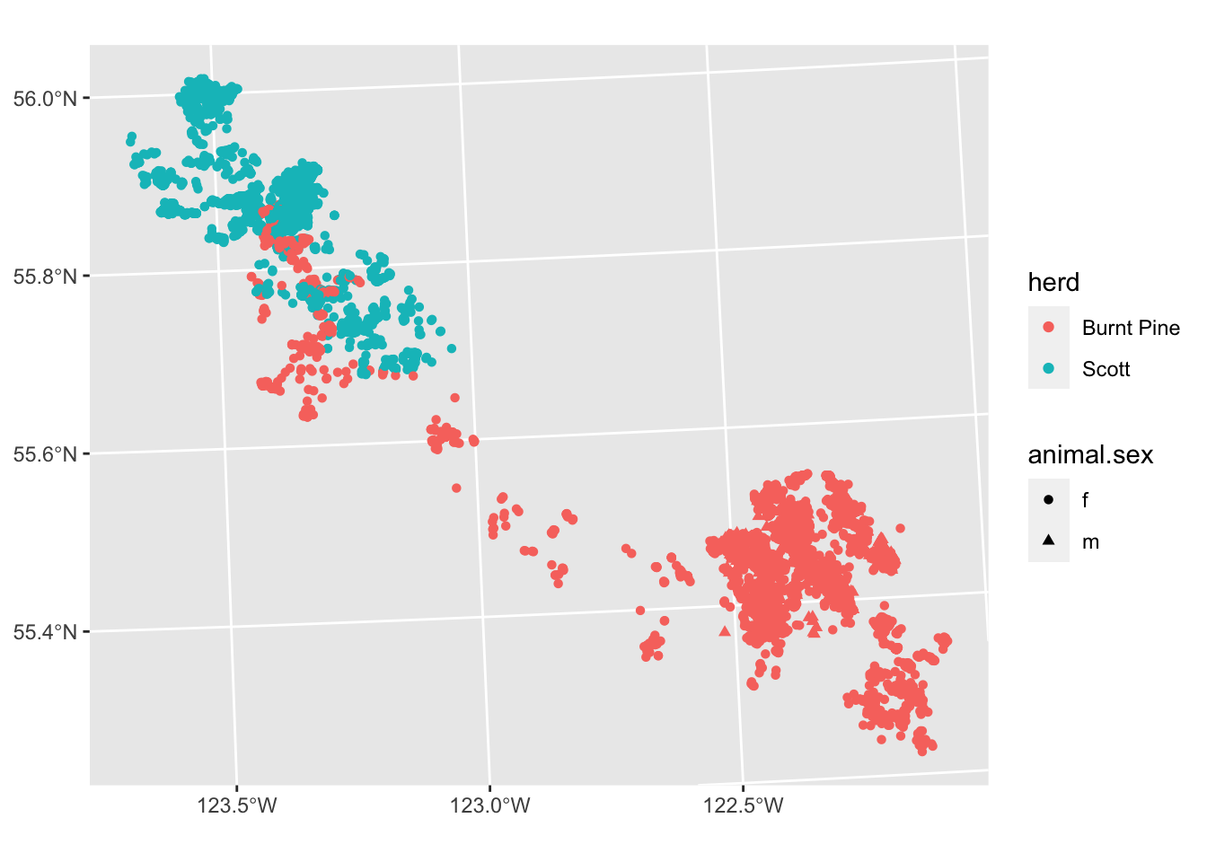
ggplot(data = caribou) +
  geom_sf(
    aes(colour = herd, shape = animal.sex)
  )
We have a lot of overlapping points, so the actual density of fixes is obscured. We can address this in several ways:
Transparency
We can see the density of points better by making them partially transparent. We do this by setting the alpha parameter to a value between 0 and 1 (0 is fully transparent, 1 is fully opaque).
Note that we are setting alpha to a constant value outside the aes() call, so the setting applies equally to all points (it is not mapped to a variable).
ggplot(data = caribou) +
  geom_sf(
    aes(colour = herd),
    alpha = 0.1
  ) +
  scale_colour_viridis_d() +
  theme_bw()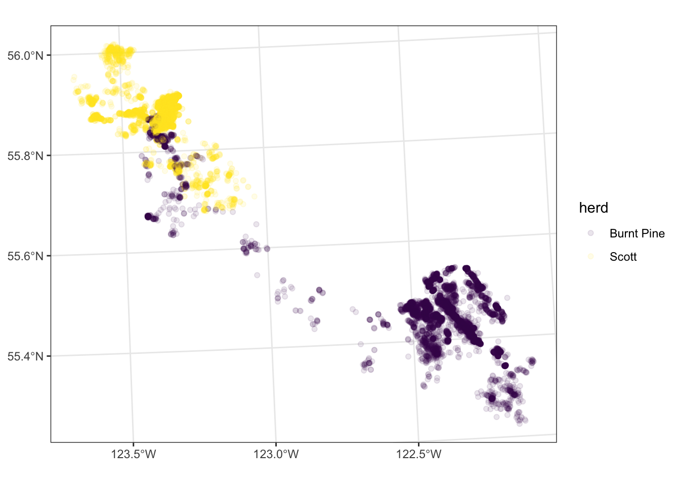
We can subset our plot into “small multiples”, or “facets” - making a small plot for each level of a variable in our data. For example, let’s look at the distribution of points in each month, still colouring the points by herd:
ggplot(data = caribou) +
  geom_sf(
    aes(colour = herd),
    alpha = 0.1
  ) +
  scale_colour_viridis_d() +
  facet_wrap(vars(month)) +
  theme_bw()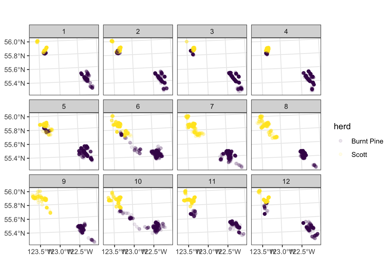
Your turn
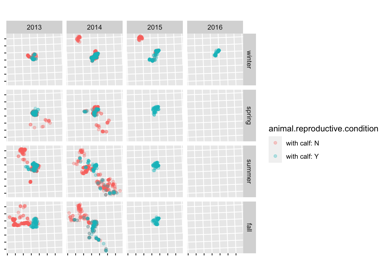
Read in the scott data (clean_data/scott_herd_subset.gpkg), and plot the fixes, coloured by reproductive condition, and faceted by season and year. Hint: see ?facet_grid.
For bonus points, remove the lat/long labels using the theme() function.
scott <- read_sf("clean_data/scott_herd_subset.gpkg")

ggplot(scott) +
  geom_sf(aes(colour = animal.reproductive.condition), alpha = 0.3) +
  facet_grid(season ~ year) +
  theme(axis.text = element_blank())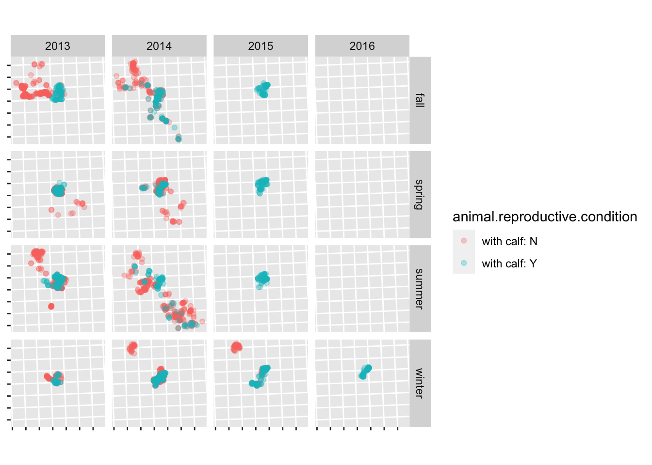
to get the seasons in a sensible order, set them to a factor and define the order of the levels:
Binning
Another way to look at the density of points is binning - sort of like a spatial histogram, but instead of using bar height to represent relative numbers, use colour. We can use geom_hex() to divide our space up into a hexagonal grid and colour the hexagons based on the number of points in each:
# Start by extracting the X and Y coordinates as columns in our data set:
caribou <- cbind(st_coordinates(caribou), caribou)

head(caribou)
Simple feature collection with 6 features and 17 fields
Geometry type: POINT
Dimension: XY
Bounding box: xmin: 1149513 ymin: 1207479 xmax: 1159827 ymax: 1214219
Projected CRS: NAD83 / BC Albers
X Y location.long location.lat herd tag.local.identifier
1 1149513 1214219 -123.6036 55.90000 Scott car170
2 1149921 1211265 -123.5987 55.87343 Scott car170
3 1150438 1211425 -123.5903 55.87470 Scott car170
4 1156753 1207479 -123.4915 55.83741 Scott car170
5 1157677 1212132 -123.4740 55.87877 Scott car170
6 1159827 1209456 -123.4412 55.85412 Scott car170
animal.id animal.sex animal.reproductive.condition tag.manufacturer.name
1 SC_car170 f with calf: N ATS
2 SC_car170 f with calf: N ATS
3 SC_car170 f with calf: N ATS
4 SC_car170 f with calf: N ATS
5 SC_car170 f with calf: N ATS
6 SC_car170 f with calf: N ATS
tag.model date_time year month day hour minute
1 GPS Iridium 2013-09-23 03:01:00 2013 9 23 10 1
2 GPS Iridium 2013-10-09 03:01:00 2013 10 9 10 1
3 GPS Iridium 2013-10-30 03:01:00 2013 10 30 10 1
4 GPS Iridium 2014-08-11 03:01:00 2014 8 11 10 1
5 GPS Iridium 2013-11-09 18:01:00 2013 11 10 2 1
6 GPS Iridium 2014-08-07 03:01:00 2014 8 7 10 1
geom
1 POINT (1149513 1214219)
2 POINT (1149921 1211265)
3 POINT (1150438 1211425)
4 POINT (1156753 1207479)
5 POINT (1157677 1212132)
6 POINT (1159827 1209456)ggplot(data = caribou) +
geom_hex(aes(x = X, y = Y)) +
scale_fill_viridis_c() +
coord_sf() +
theme_bw()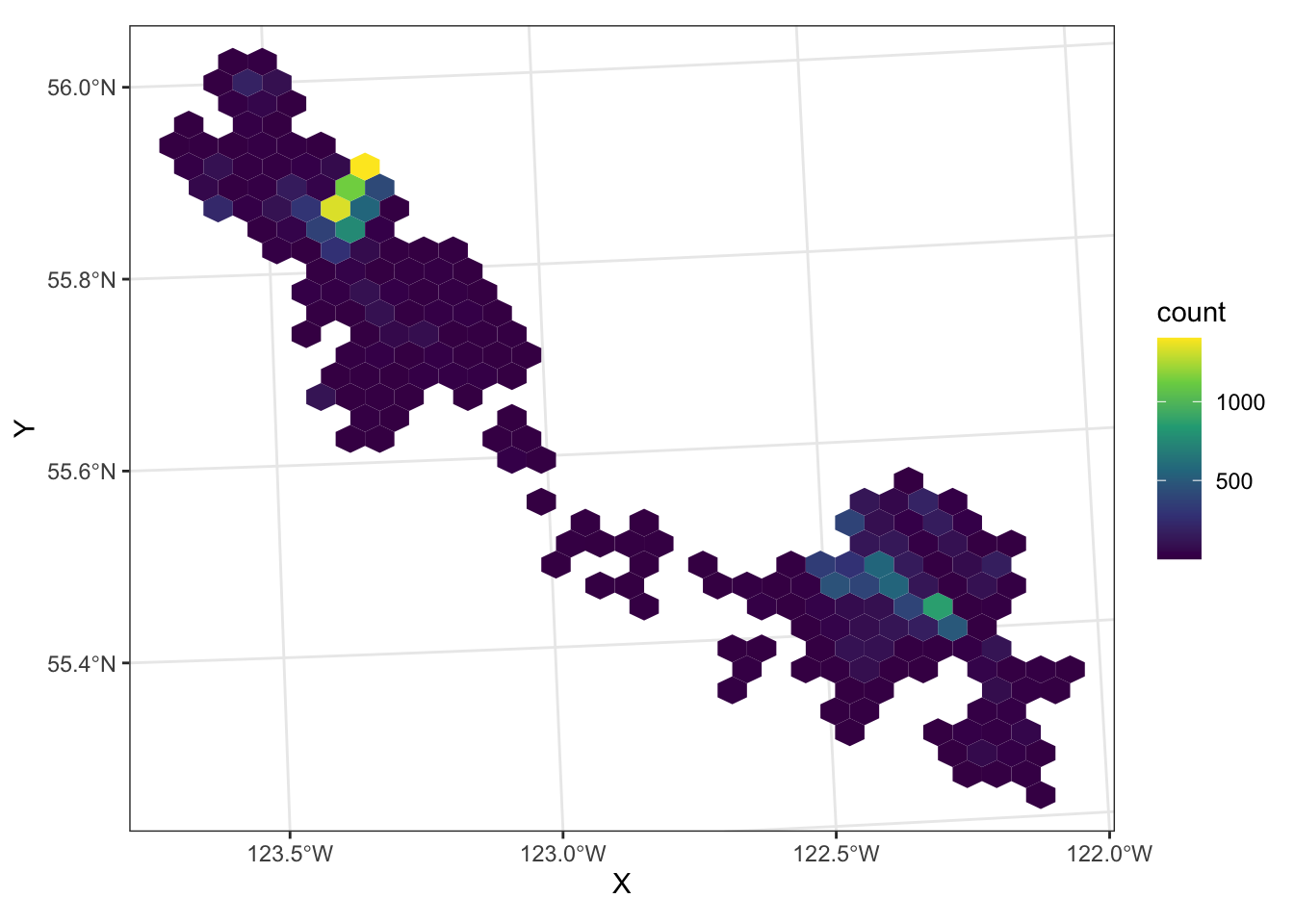
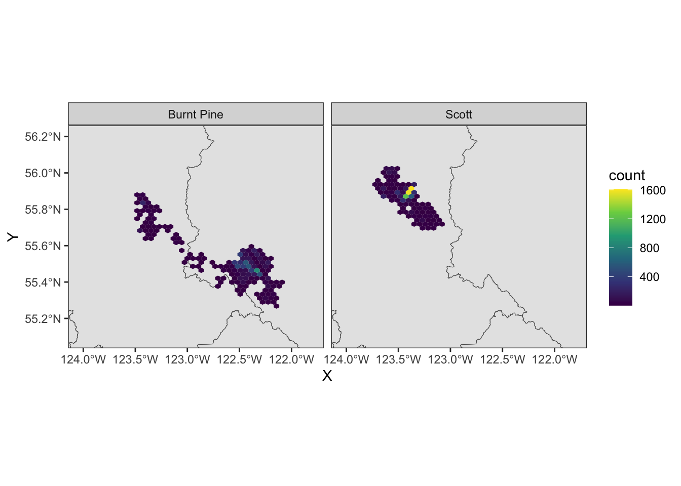
We can still use faceting to split out the two herds:
ggplot(data = caribou) +
  geom_hex(aes(x = X, y = Y)) +
  scale_fill_viridis_c() +
  coord_sf() +
  facet_wrap(vars(herd)) +
  theme_bw()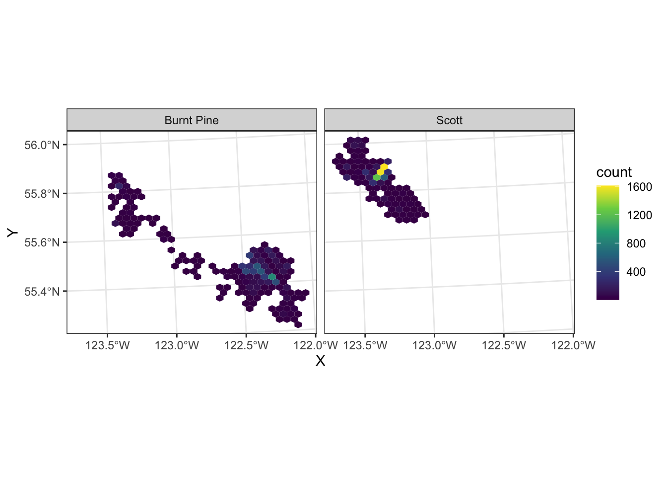
If we want to add multiple layers to our map, we simply add multiple geoms, and add the name of the layer to the data argument in each:
ggplot() +
  geom_sf(data = nr) +
  geom_hex(aes(x = X, y = Y), data = caribou) +
  scale_fill_viridis_c() +
  facet_wrap(vars(herd)) +
  theme_bw()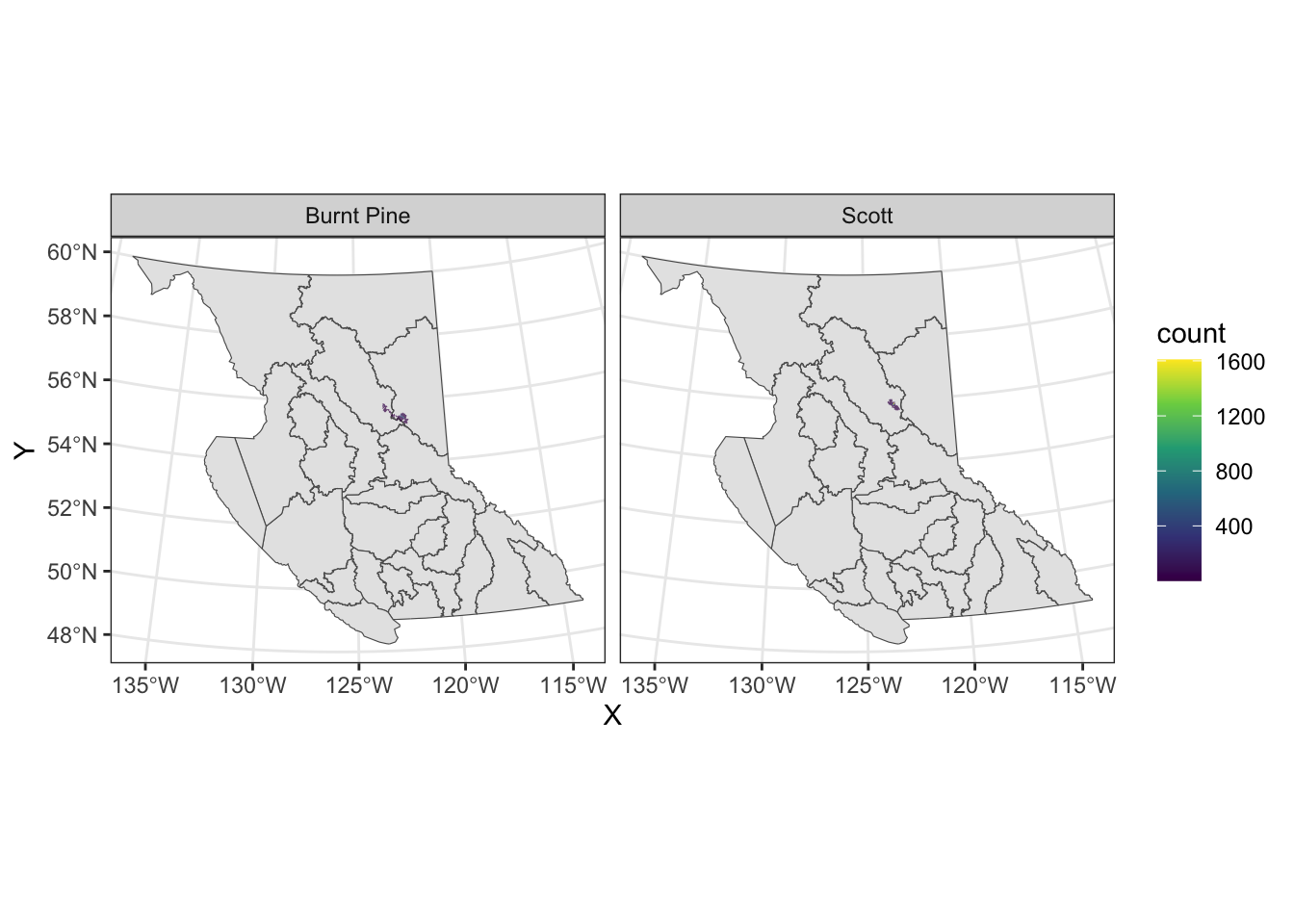
We can zoom in by specifying the plot limits in coord_sf()
Probability density
We can also visualize a smooth probability density of fixes, using the ggdensity package:
library(ggdensity)

ggplot(data = caribou) +
  geom_hdr(aes(x = X, y = Y, fill = herd)) +
  coord_sf() +
  theme_bw()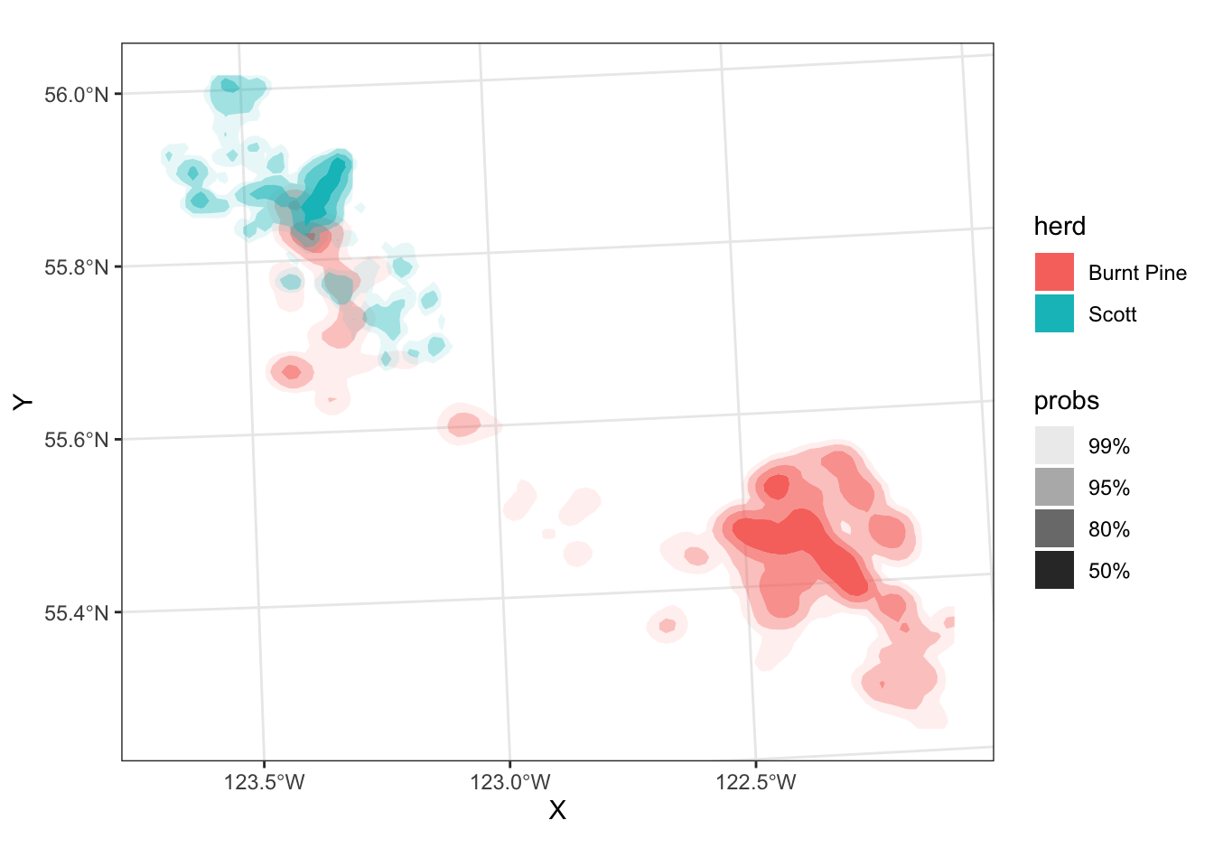
The regions have probabilities mapped to the alpha aesthetic by default - the probs legend shows the alhpa levels.
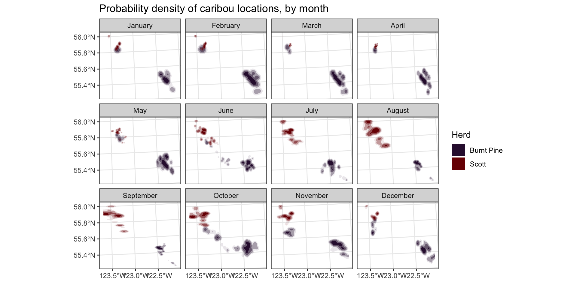
Now let’s do a bit of work to make the plot look more finished:
month_labels <- setNames(month.name, 1:12)

ggplot(data = caribou) +
  geom_hdr(aes(x = X, y = Y, fill = herd)) +
  scale_fill_viridis_d(option = "turbo") +
  scale_alpha_discrete(guide = "none") +
  coord_sf() +
  facet_wrap(
    vars(month),
    labeller = as_labeller(month_labels)
    ) +
  theme_bw() +
  labs(
    title = "Probability density of caribou locations, by month",
    x = element_blank(),
    y = element_blank(),
    fill = "Herd"
  )
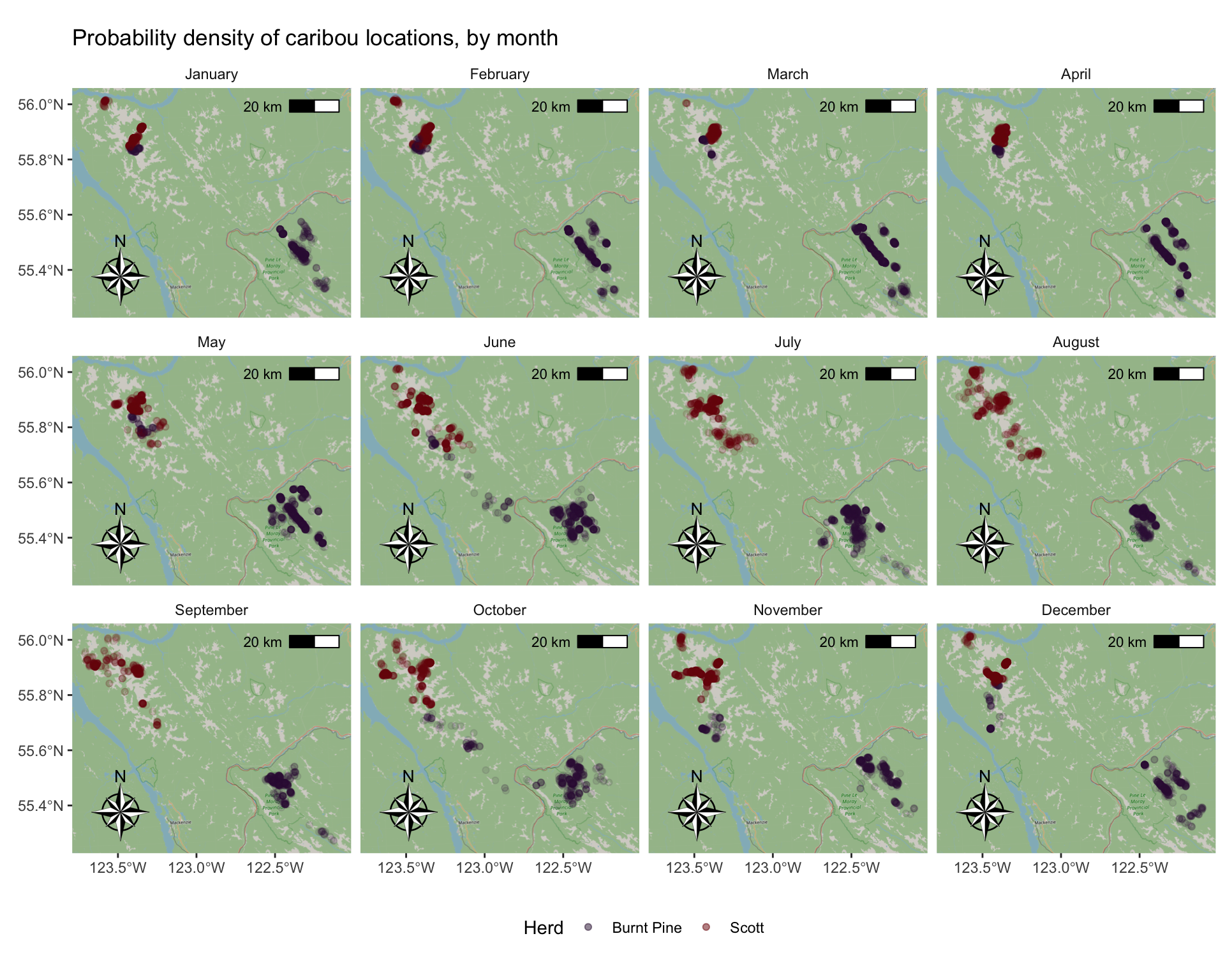
Add a base map, north arrow, & scale
We can use functions from the ggspatial package to add some nice touches to our map to make it pretty.
We can also customize the labels, legend, and theme elements
# install.packages(c("ggspatial", "prettymapr"))
library(ggspatial)

ggplot(caribou) +
  # add background map
  annotation_map_tile(zoom = 9) +
  # add points
  geom_sf(aes(colour = herd), alpha = 0.1) +
  # set colour palette and increase legend alpha so you can see it
  scale_colour_viridis_d(
    option = "turbo",
    guide = guide_legend(override.aes = list(alpha = 0.5))) +
  # Add a North arrow and scale bar
  annotation_north_arrow(style = north_arrow_nautical()) +
  annotation_scale(location = "tr") +
    coord_sf() +
  # Facet by month, custom label the facets
  facet_wrap(
    vars(month),
    labeller = as_labeller(month_labels)
    ) +
  # Add a title, remove X and Y labels
  labs(
    title = "Probability density of caribou locations, by month",
    x = element_blank(),
    y = element_blank(),
    colour = "Herd"
  ) +
  # Set background of facet labels and legend to white,
  # put legend on the bottom
  theme(
    strip.background = element_rect(fill = "white"),
    legend.key = element_rect(fill = "white"),
    legend.position = "bottom"
  )
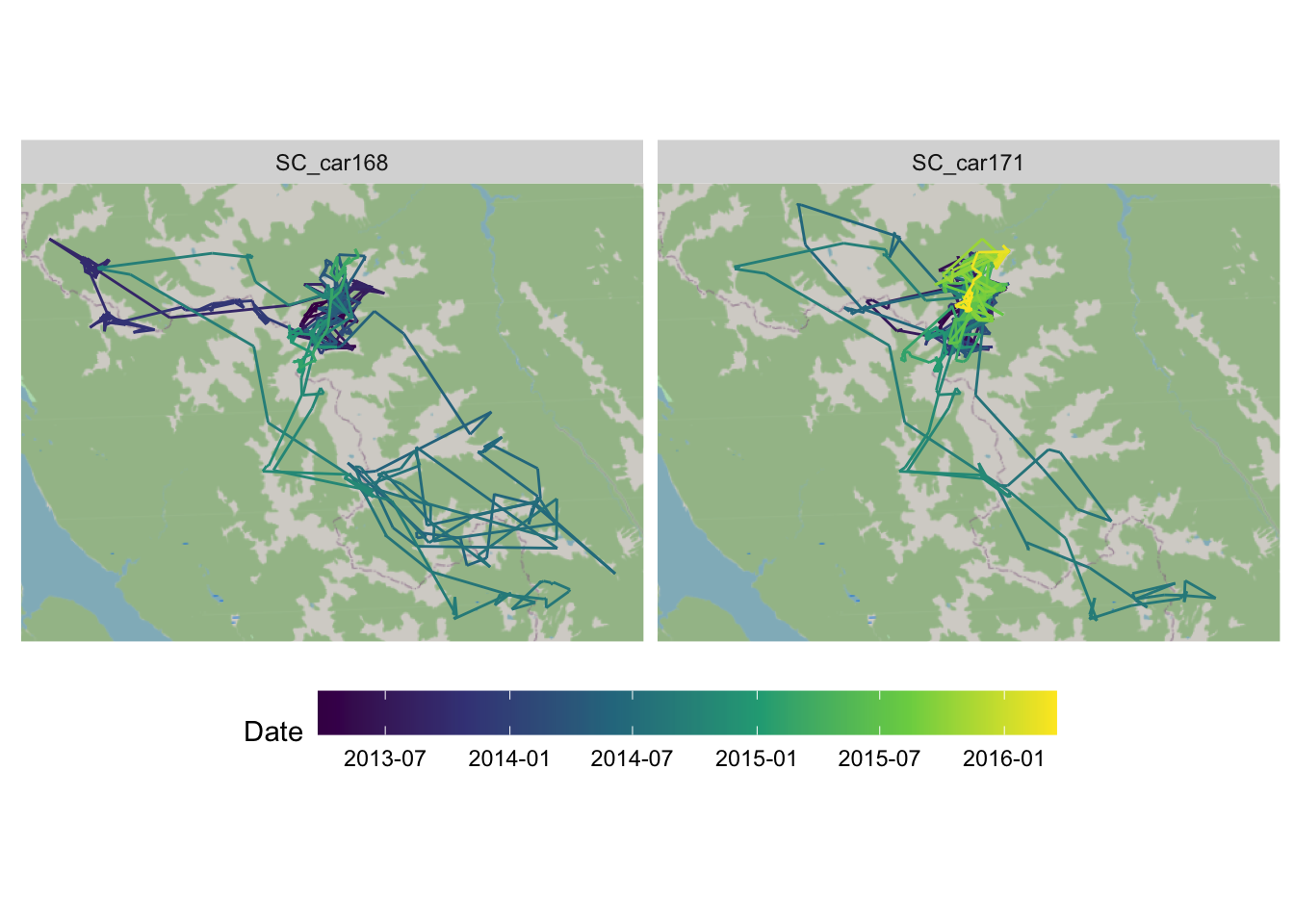
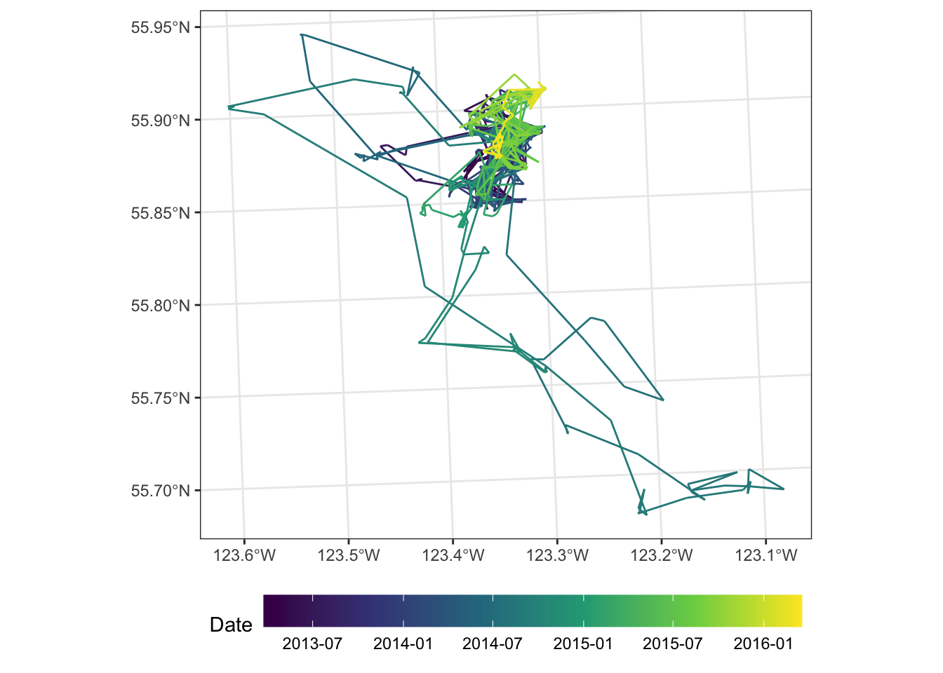
We can also look at the movement of just one or two animals:
scott <- read_sf("clean_data/scott_herd_subset.gpkg")

scott <- cbind(st_coordinates(scott), scott)

mvmt <- scott |>
  filter(animal.id == "SC_car171")

ggplot(mvmt) +
  geom_path(aes(x = X, y = Y, colour = date2)) +
  scale_color_viridis_c(n.breaks = 6, trans = "date") +
  coord_sf() +
  labs(colour = "Date") +
  theme_bw() +
  theme(
    axis.title = element_blank(),
    legend.position = "bottom",
    legend.key.width = unit(4, "lines")
  )
Your turn:
Modify the previous map to make a faceted (small-multiples) map for two or more animals, and add a background map.
top_animals <- c("SC_car171", "SC_car168")

mvmt <- scott |> filter(animal.id %in% top_animals)

ggplot(mvmt) +
  annotation_map_tile(zoom = 10) +
  geom_path(aes(x = X, y = Y, colour = date2)) +
  facet_wrap(vars(animal.id)) +
  scale_color_viridis_c(n.breaks = 6, trans = "date") +
  coord_sf() +
  labs(colour = "Date") +
  theme(
    axis.title = element_blank(),
    axis.text = element_blank(),
    axis.ticks = element_blank(),
    legend.position = "bottom",
    legend.key.width = unit(4, "lines")
  )